

Date: 12.03.2014
mono goes Responsive!
No longer just a buzzword, ‘responsive design’ is here to stay and it’s also now the standard for mono sites! Are you as excited as we are? You should be!
We’re proud to say that mono’s responsive design is more than your average responsive design giving you a lot of flexibility while making site management much more effective. This post will tell you all you need to know about getting your mono site up and running in responsive mode and how to use it to fit the needs of your business.
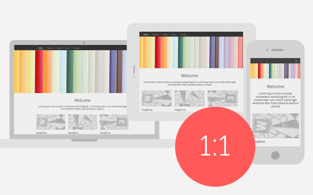
The short version is that responsive design ensures that your website looks great on all devices and screen resolutions/sizes.
In more detail, responsive design uses one html code for your website rather than creating two sets of html (one for desktops and one for mobile devices). This is easier for search engines to index, thus you guessed it – better for SEO. In responsive design, your site content is displayed in different layouts in order to be optimized for the screen size giving a much better user experience.
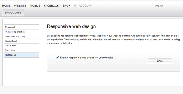
To activate responsive design for an existing mono site you’ll need to have created your site after February 2011 and use a D4 design skin (http://www.mono.net/d4-design-2013-10-23). In the tool go to ‘My Account’ and in the left-hand-menu click ‘Responsive’. Here you can activate responsive design.
The tool will alert you that you’ll no longer be able to see your previous mobile site but don’t worry, you can always get it back by deactivating responsive design.
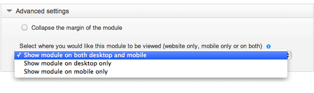
Presenting your entire website (especially if it’s particularly complex) to mobile users is less than ideal so responsive design is not the whole story. This is where mono has got you covered. With responsive design in the mono tool, you can still highly customize the mobile user experience by selecting which pages and which modules you’d like to show on desktops, mobile devices or both.
This means you can limit the pages shown on mobile devices, add specific pages or even just particular modules to pages that are most helpful for mobile users (click-to-call buttons, maps, etc). This is the best of both worlds. You get amazing responsive design which will display your site beautifully no matter what the screen size, but you’ll also be able to fully tailor your site to mobile users on the go.
Once responsive design is activated, you’ll no longer see a ‘Mobile’ tab in the menu at the very top of the tool. Instead, in your ‘Website’ tab you’ll see a mobile and desktop icon at the top of the page structure area on the left-hand side of the editor view. Click these icons to switch between the desktop and mobile views of your site.

Activating mono Responsive design is completely risk-free. You can always switch back and use your old mobile site again. For 90% of websites, responsive design is a much more effective way to manage the mobile experience and will save you a lot of time in maintaining your site but don’t take our word for it, try it for yourself and let us know how it goes!
